WEB DESIGN AGENCY IN MOUNT AIRY
You Give Your All. Your Website Should, Too.
An underperforming website is more than an eyesore, it’s a leak in your revenue.
In a world where customers demand instant speed and seamless navigation, a “good enough” site is a liability. If your pages are slow or your layout is confusing, your potential clients won’t wait; they’ll bounce to a competitor. You don’t just need a digital placeholder; you need a strategic business asset.
We specialize in high-performance web design that bridges the gap between looking sharp and driving sales. We build lightning-fast, conversion-focused websites designed to capture attention and turn browsers into buyers.
Stop losing leads. Start scaling your business.
Your Website, Handled.
You bring the vision; we do the heavy lifting. No coding required, no SEO stress, and no DIY copy. Just a professional digital presence that works as hard as you do.
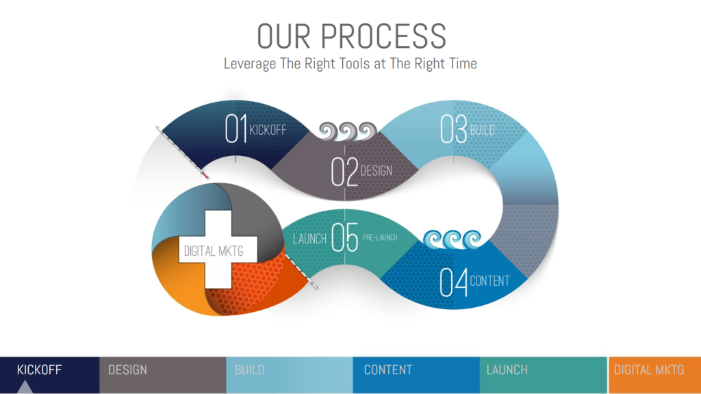
Our Process
01. KICKOFF
We start by understanding your brand, target audience, and project goals to build a solid foundation.
02. DESIGN
Creating high-fidelity mockups that bring your visual identity to life with a focus on user experience.
03. BUILD
Turning designs into a responsive, fast-loading WordPress website using clean code.
04. CONTENT
Writing SEO optimized content to rank on search engines and attract your ideal customers.
05. LAUNCH
Final testing and pre-launch optimization to ensure everything is perfect for your visitors.
06. DIGITAL MARKETING
Strategic marketing and ongoing optimization to drive traffic and scale your online presence.
Web Design Agency in Mount Airy
Benefits of Working With Us
Custom Designs
We create customized designs that align with your brand, ensuring they meet your business needs and provide a unique digital presence.
Accessible Interfaces
We design intuitive interfaces that enhance user experience, making navigation seamless and ensuring accessibility for all visitors to your website.
Responsive Design
Our websites adapt to all devices, from desktops to smartphones, ensuring a consistent and smooth user experience across multiple platforms.
SEO Optimization
We implement SEO best practices to improve search rankings, helping your website gain visibility and attract organic traffic effectively.
Fast Load Times
We optimize website performance to achieve fast load times, ensuring visitors stay engaged and reducing bounce rates for better retention.
Ongoing Support
Our services include ongoing maintenance, updates, and support to keep your website secure, functional, and aligned with evolving needs.
Post-Deployment Strategy: Stability Meets Growth
A great website is the foundation, but performance and visibility are the engines of growth. Beyond strategic SEO to amplify your reach, we provide elite hosting and managed services to ensure your platform remains lightning-fast, secure, and always open for business.
Web Design Agency in Mount Airy
What Our Trusted Client Say
EXCELLENTTrustindex verifies that the original source of the review is Google. Very. good experience they are easy to work with and very knowledgable, I would highly recommend Elite Digital Designs to build you a website and help your business growPosted on GoogleTrustindex verifies that the original source of the review is Google. We’ve worked with Tim with our Facebook marketing, and they’ve been fantastic. Professional, responsive, and highly skilled—they were transparent and very helpful with any underlying issues he saw we needed help with. Highly recommended! Very Responsive!Posted on GoogleTrustindex verifies that the original source of the review is Google. Tim and his team went above and beyond to meet our advertising needs.Posted on GoogleTrustindex verifies that the original source of the review is Google. Tim and his team are wonderful to work with. They are extremely knowledgeable and explain everything to where you can understand it. They make sure your website is 100% professional and the way YOU envision it. I will continue to work with them in the future. I have already noticed an increase in call volume!Posted on GoogleTrustindex verifies that the original source of the review is Google. Ahmed has been absolutely fantastic to work with! I brought him a simple idea, and he turned it into something that truly stands out. He really took the time to listen to my input, then pushed it even further, making sure every detail was better than I imagined. If you want someone creative, collaborative, and genuinely invested in your vision, I highly recommend Elite Digital Designs!Posted on GoogleTrustindex verifies that the original source of the review is Google. Tim and his team are first class. They kept me informed during every step of the process and the results are better than expected. In one month we experencied a 200% increase in viable sales leads. Elite Digital Designs will treat your business like their business.Posted on GoogleTrustindex verifies that the original source of the review is Google. Hiring Elite Digital Designs was a game-changer for my business. Their team undertook a complete overhaul of our website and implemented cutting-edge SEO strategies that significantly boosted our online presence. What impressed me most was their attention to detail and the personalized approach they took to understand my business goals. The new website is not only visually stunning but also optimized for conversions, leading to an increase in customer engagement and sales. Their customer service is exemplary, with regular updates and professional guidance throughout the process. I highly recommend Elite Digital Designs to any business looking to enhance its digital footprint.Posted on GoogleTrustindex verifies that the original source of the review is Google. Tim and his team are the real deal. With their experience in the marketing industry they can bring any business from the bottom to the top, if I could give them more than 5 stars I would.Posted on GoogleTrustindex verifies that the original source of the review is Google. Tim is generous, hard-working, and reliable.Posted on GoogleTrustindex verifies that the original source of the review is Google. Tho we didn’t end up needing them they still were amazing on looking into our stuff and telling us on what we could change to help
Your Next Step Starts Here!
Ready to take your business online or give your existing site a fresh look? Let’s work together to create a high-performing website that drives real results. Get started today by reaching out to our team for a consultation!
Subscribe To Our Newseletter
Contact Info